
In recent years we saw many things machine learning can do - including meaningful contributions for cancer care. Machine learning algorithms can help detect cancer early, monitor response to therapy, and even understand the underlying cellular processes that led to cancer in the first place.
An example of the last point is analyzing gene expression of tumor cells, determining what is different from the normal gene expression, and identifying genes to be targeted with therapies.
A gene can be targeted with a small molecule drug or an antibody, which can bind to a protein produced by the gene and inactivate it. Proteins are the workhorse of a cell: they fulfill many functions in a cell and can regulate the expression of other genes.
Some genes and their proteins are known as cancer drivers, driving a cell to proliferate uncontrollably. If such a protein is inactivated, it can have cascading effects on the expression of other genes, reversing the cancer phenotype and stopping the aberrant cell proliferation.
Mapping out the cascading effects of silencing a single gene (and therefore identifying such key potential driver genes which should be targeted by therapies) is in progress.
The network of how each gene affects others is so complicated that we don’t yet have a simple way to fix cancer.
The best we can do is apply statistical methods. We can aim to bring the overall gene expression profile of the tumor cells in line with the healthy cells and hope that fixes something.
But how can we pick the most effective gene to target? That’s where data science comes into play. The task seems simple - massive amounts of experimental data are available, but still the datasets are incomplete and potentially noisy.
This blog post is going to demonstrate how to analyze a potential therapeutic target in liver cancer with gene expression analysis.
Cancer changes the expression of many genes in tumor samples compared to the peritumor (healthy tissue surrounding the tumor) samples. We want to find genes where inactivating just one gene would reverse this and make the tumor cells more like the healthy cells.
In a collaboration with a leading biotech company, our team demonstrated how to use LynxKite to analyze a set of genes that are overexpressed in a condition and identify a target or a biomarker of poor prognosis or response to therapy.
We simulated the impact of an expression change of a single gene on a network of co-expressed genes along edges. As a graph analytics-based software suite, LynxKite is an ideal tool for the task.
Datasets used for this job:
STRING protein-protein interaction dataset
Paired tumor-peritumor gene expression for hepatocellular carcinoma (HCC) – GSE14520
WNT-Beta-Catenin signaling pathway – example pathway involved in HCC
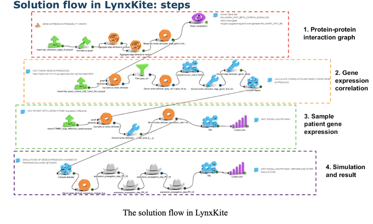
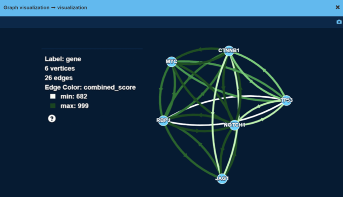
Step 1: Build the protein-protein interaction graph
The WNT-Beta-Catenin pathway was chosen as a canonical cancer pathway. It consists of 39 genes which is a relatively small number.
We picked the WNT-Beta-Catenin pathway out of the STRING dataset:
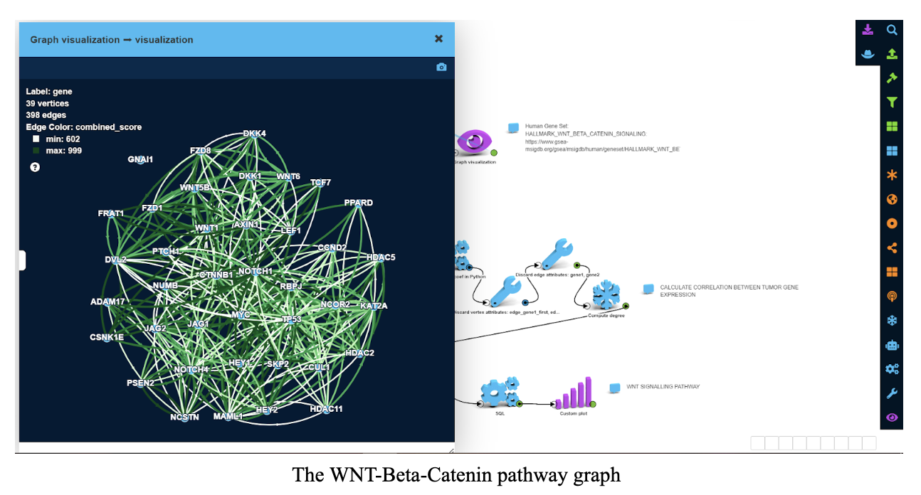
On this graph, vertices are genes and edges are protein-protein interactions (PPIs). Examples for such PPIs include:
1. One protein inhibiting another
2. One protein acting as a transcription factor resulting in the production of another protein
3. One protein signalling directly to another protein
4. Several proteins forming a protein complex that can perform some function
Color and width of an edge on the screenshot correspond to overall confidence in interaction between two proteins.
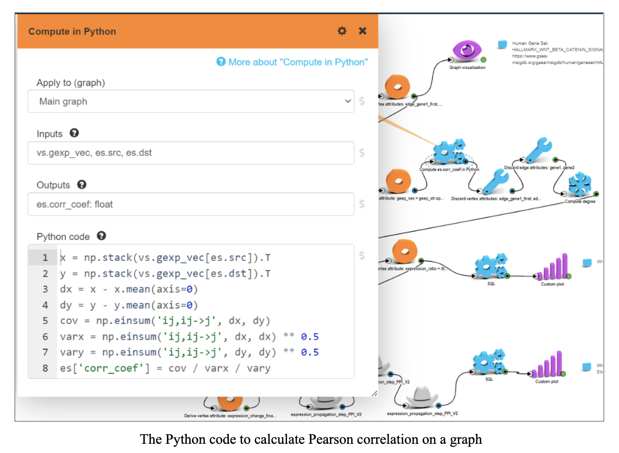
Step 2: Calculate gene expression correlation in samples
Gene expression data is basically a table where rows are samples (patients) and columns are genes. The expression values represent the amount of RNA molecules of that gene in cells, and RNA molecules are precursors to translating that gene into a protein and therefore a proxy of that gene’s protein produced by the cells.
We loaded gene expression data for tumor samples from the GSE HCC dataset, set tumor gene expressions as vertex attributes in PPI graph and for every existing edge in PPI graph calculated Pearson correlation coefficient between gene expressions using tumor samples from the GSE HCC dataset.
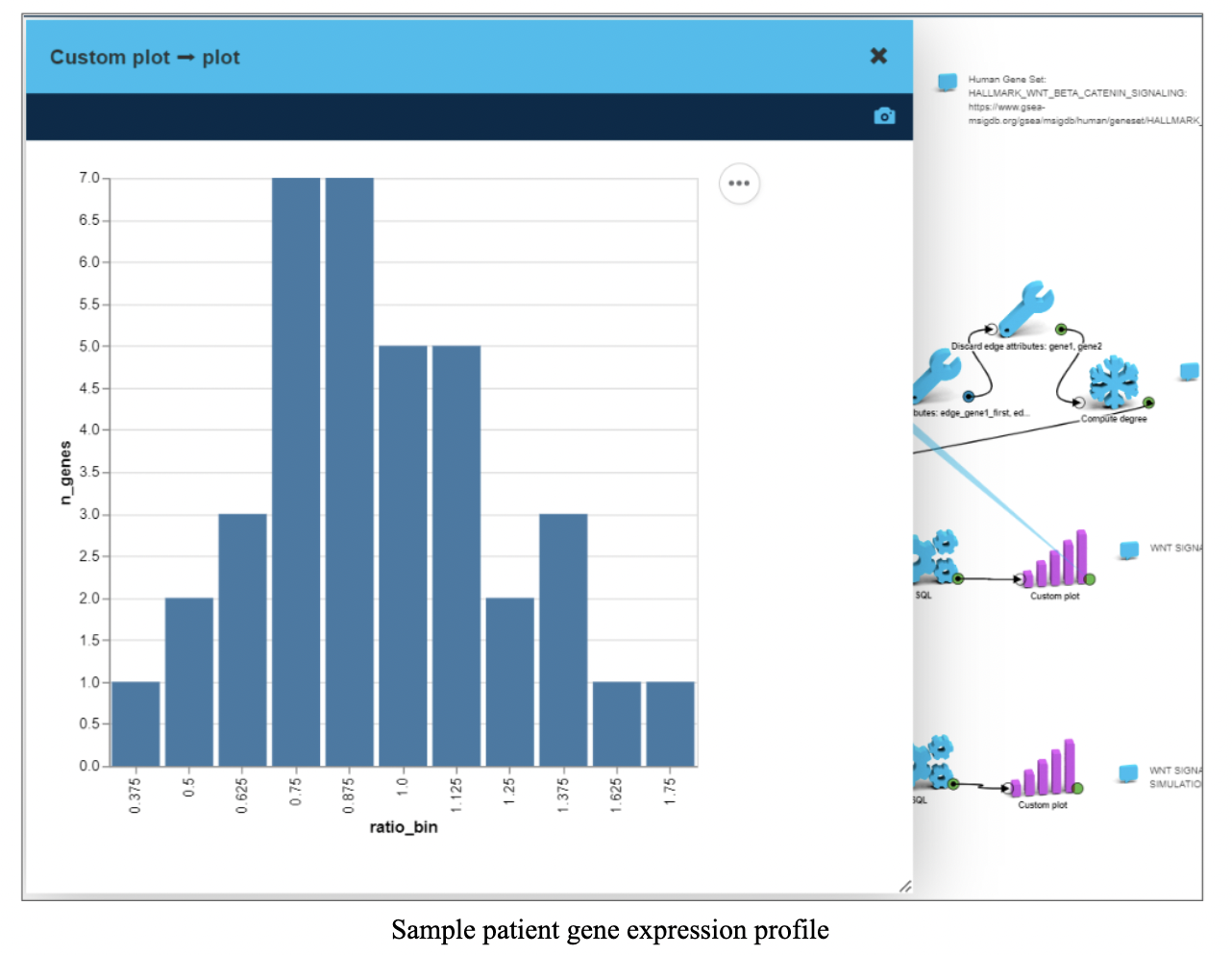
Step 3: Sample patient gene expression
For the simulation, the CTNNB1 gene was chosen as a potential treatment target for HCC
We selected a patient from the GSE dataset with a large difference in CTNNB1 expression between tumor and peritumor and loaded that patient’s gene expressions as vertex attributes.
The chart on the screenshot shows distribution of tumor over peritumor gene expression ratios within WNT-beta-Catenin pathway.
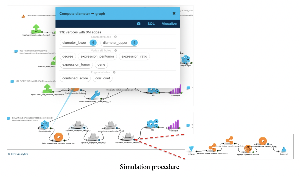
Step 4: Simulation
This was the whole point of the task - we brought gene expression of CTNNB1 from tumor level to peritumor level and estimated the impact on tumor gene expressions within the WNT-beta-Catenin pathway.
Simulation is done as follows: for every edge in the graph we have a correlation coefficient between those two genes derived from gene expression in tumor samples. If there is an edge from gene 1 to gene 2, a change in gene 1 results in corr*X change in gene 2 (propagation on neighbors).
After four consecutive propagations all genes in the network had some change. (The diameter of the graph is 4.)
To make things simpler, at each step we propagated only to those genes that have not had any change in steps before that.
Each step (a gray hat on the screenshot to the left – expanded below) is a propagation of a change in tumor gene expression to its neighbors.
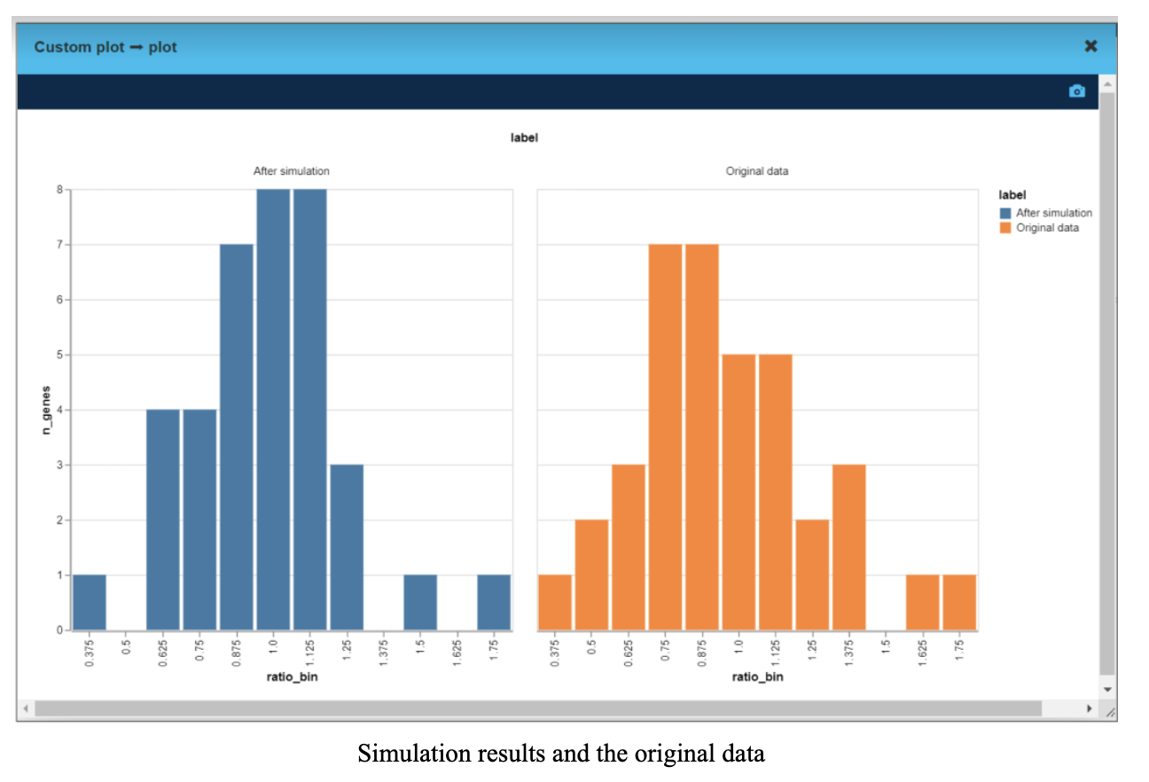
We took gene expression for tumor and peritumor for each of 39 genes for the same individual. Then for every gene we calculated tumor over peritumor expression ratio - on the “after” chart, the distribution is narrower and more centered around 1 (value 1 means the tumor gene expression is the same as a peritumor gene expression).
That means manipulating the expression level of CTNNB1 gene altered the gene profile in the tumor to be closer to the peritumor sample.
To summarize, we simulated the impact of changes in gene expression across the network of genes. We can now rank genes based on their effect on the network and distance from the expression profile of healthy tissue.
The highest ranking genes are the best candidates for novel drug targets.
This ranking allows a more focused research with faster turnaround and a better chance of success: instead of scientists searching for a needle in the haystack, machine learning can pinpoint the most advantageous target for an effective therapeutic intervention.
Speeding up drug research is not just a way for biotech companies to save time and money, it also brings us closer to personalized medicine, where a drug could be tailor-made to save the life of a specific patient.
About the authors:
Sergii Zakharov, PhD - Senior Data Scientist, Lynx Analytics
Lena Herasymenko - Software Developer, Lynx Analytics
Olga Lyudovyk - Advisor, Computational Immunology and Oncology, Lynx Analytics | Researcher, Memorial Sloan Kettering Cancer Center | PhD candidate, Weill Cornell Medicine