A knowledge graph is a representation of structured data that captures relationships between entities and their properties. It is typically visualized as a network of vertices and edges, where vertices represent entities, such as people, places, or things, and edges represent relationships or connections between those entities.
Compared to more traditional ways of storing data in databases, knowledge graphs allow easier discovery of connections and relationships between entities. This approach can provide deeper insights into the data and help to formulate alternative hypotheses.
In this short article we will use LynxKite, a graph tool developed by Lynx Analytics, to illustrate how a vaccine knowledge graph can be built to visualize clusters of side effects and identify patients that have a specific side effect, or a combination of side effects.
Shingles and Vaccine Data
Shingles, also known as Herpes Zoster, is a disease that results in painful blistering rash caused by chickenpox virus. It can live in an inactive state for a long time inside a body, and can become active after weakening of the immune system, which frequently happens with aging.
To prevent such a disease from occuring, shingles vaccine programs are rolled out in many countries for the elderly.
For our example we decided to look at publicly available data for Shingrix, the GSK shingles vaccine.
Thus, we have downloaded a dataset that contains individual level data for age, gender, a list of side effects, and any medication that individual was taking at the time of vaccination.
Building a Graph to Show Side Effects
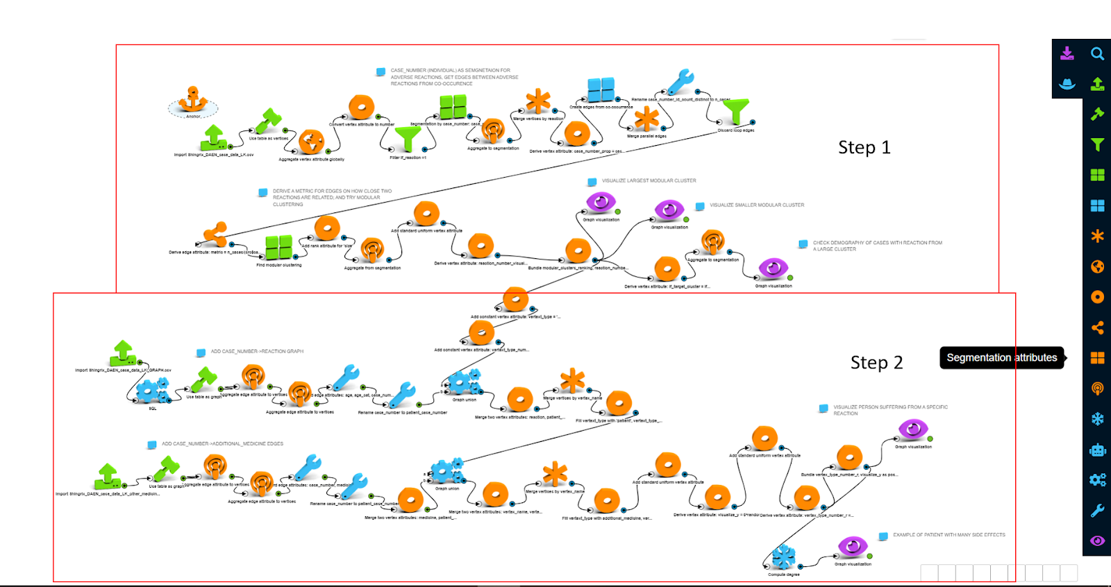
The screenshot above shows the LynxKite workflow for this project. It consists of two steps:
Step 1: create a clustering of most commonly co-occuring side effects, as well as visualize a demographic breakdown of patients with side effects in a specific cluster
Step 2: visualize individuals related to a specific side effect, as well as co-occuring side effectsTo achieve the results in Step 1, we have performed the following sequence of operations:
- Load side effects as vertices in base graph, and setup patients as a segmentation over side effects
- Create edges from co-occurence; thus, two side effects are connected if there is an individual with both side effects happening at the same time
- Perform modular clustering over side effects: this operation identifies partition of a graph into modules - sub-graphs with dense connections (or total weight of such connections if edge weight is used) within and sparse connections (or total edge weight) in between
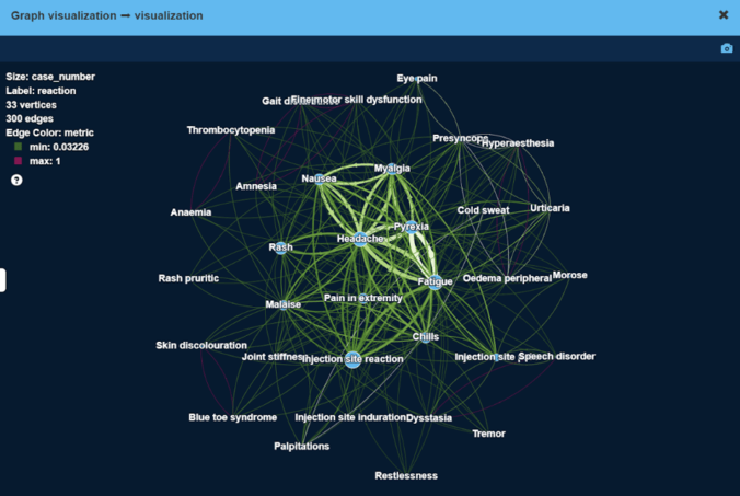
As a result, we have obtained high modularity clusters of side effects. Figure below visualizes the largest cluster of side effects.
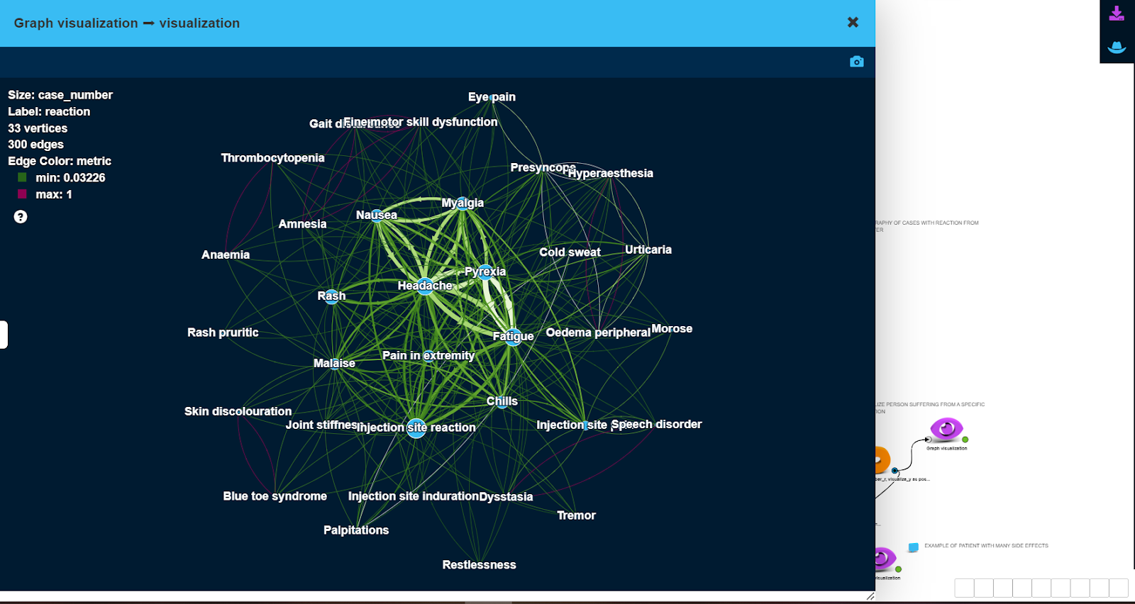
Here, vertex size is proportional to the number of patients with this side effect, edge width is proportional to the number of patients that have both side effects at the same time.
As can be seen, less severe side effects like ‘Headache’ or ‘Injection site reaction’ tend to be experienced by more patients (large vertex size), and frequently together with other less severe side effects (thick edges).
More severe side effects e.g. ‘Blue toe syndrome’ or ‘Palpitations’ are experienced by very few patients (small vertex size), sometimes together with other side effects.
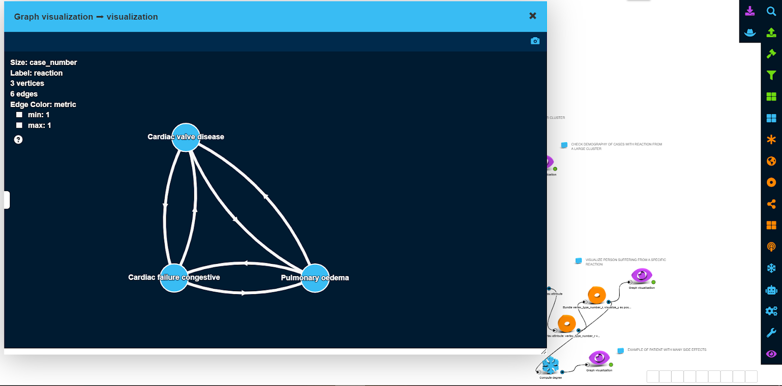
Smaller cluster of side effects are depicted in the next picture. In this case, there was only a single patient who experienced all 3 serious side effects at the same time.
Exploring the Graph
Coming back to the largest cluster, we can visualize the demographic profile of patients who experienced side effects from this cluster using a bucketed view.
This type of view allows us to group vertices based on up to two attributes and depict them in an aggregated way, as shown in the screenshot below.
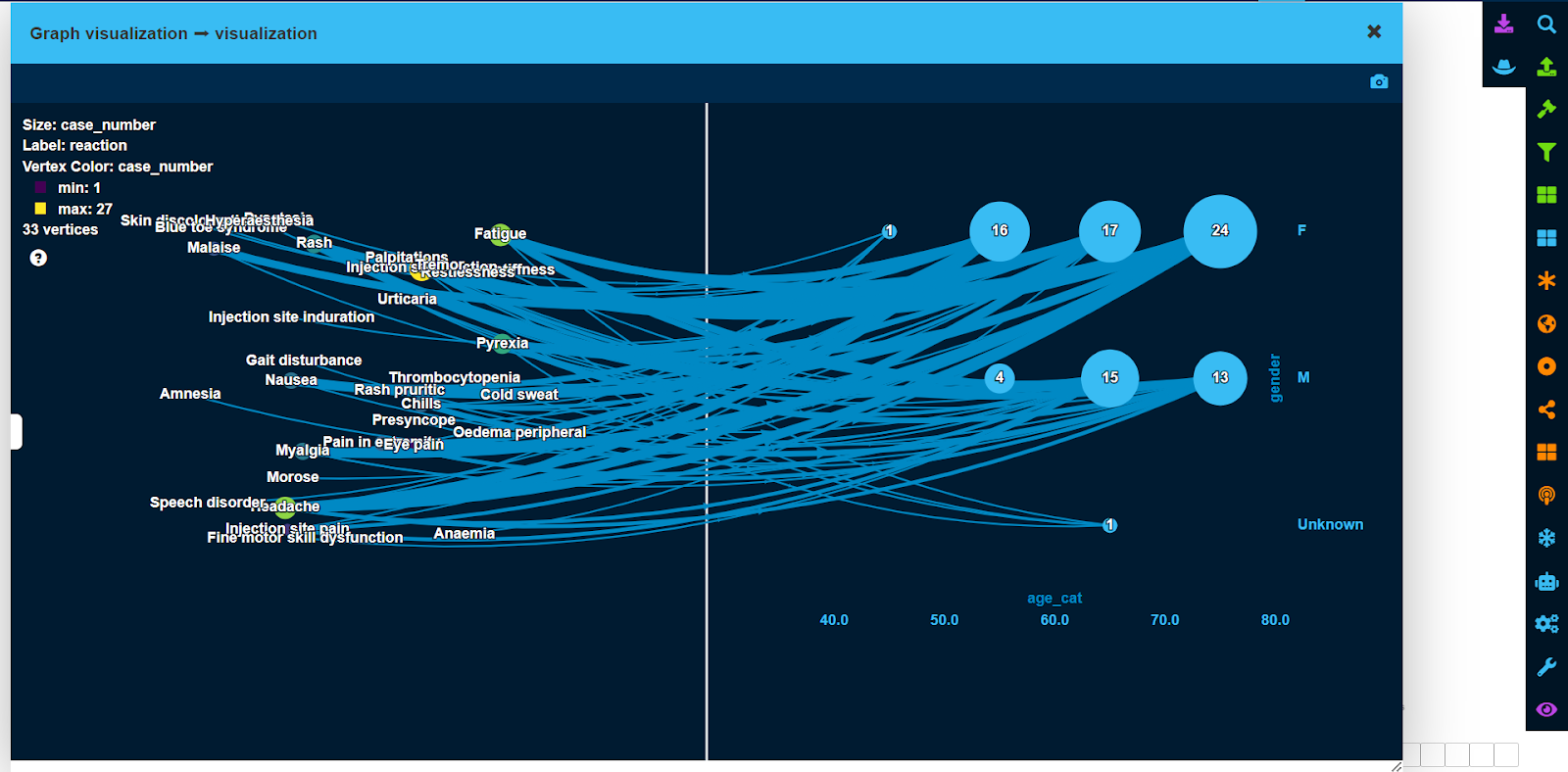
As can be seen from this example, a total of 16 female patients between the ages of 50 and 60 experienced side effects from the largest cluster, while there were only 4 males within the same age category.
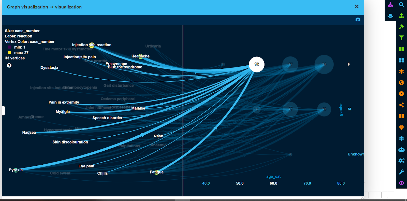
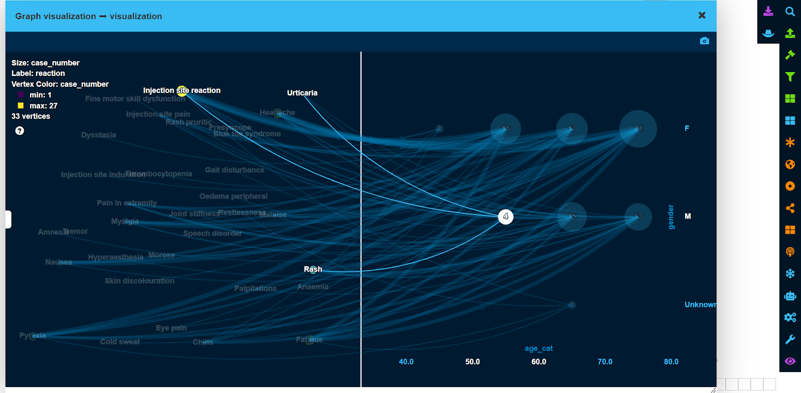
Using LynxKite, it is easy to show exactly which side effects were experienced by a specific group of patients, by just pointing a mouse cursor on that group, as shown in the screenshot below.
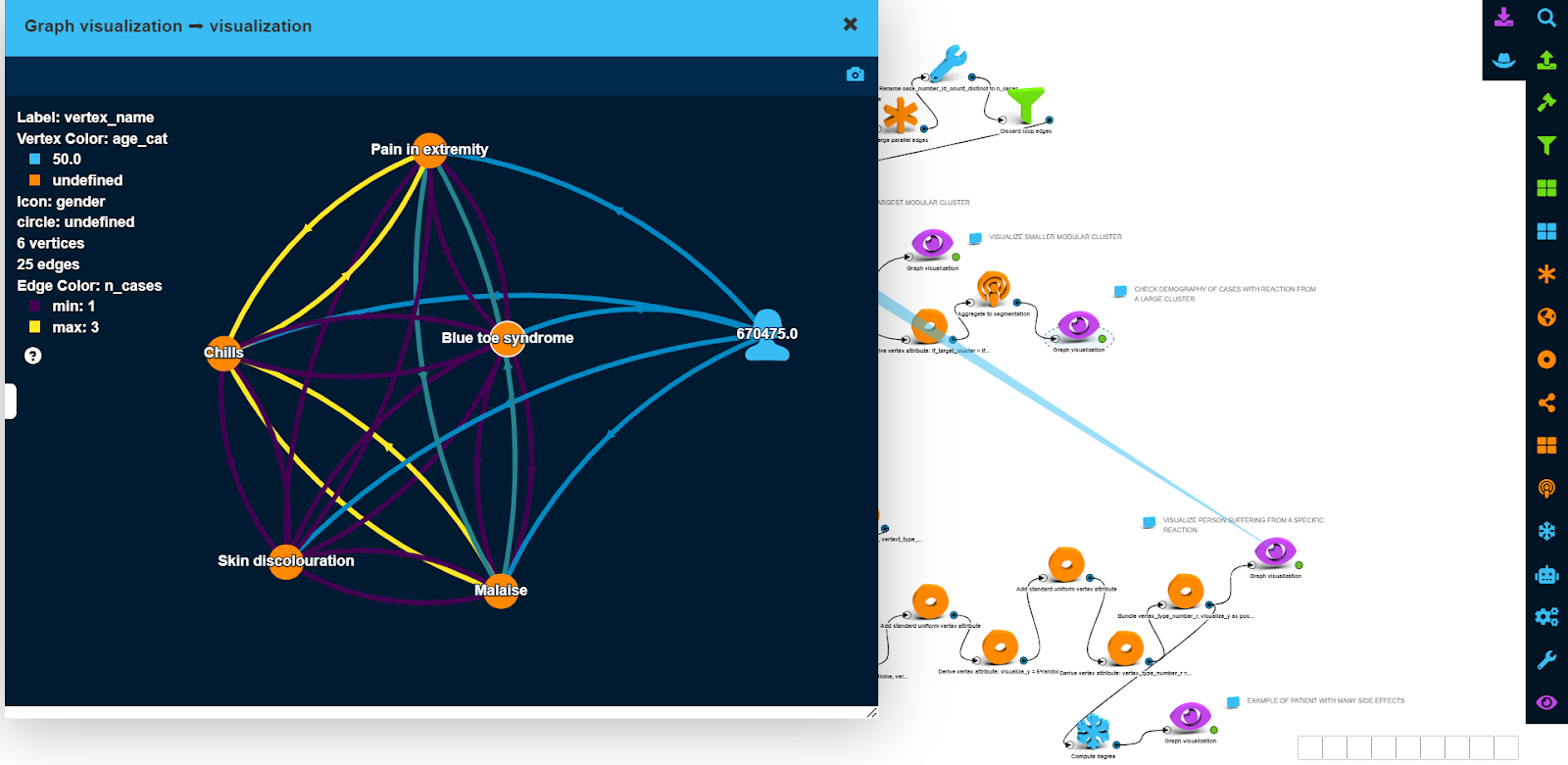
To be able to visualize actual patients with a specific side effect in the same graph, we have added “side effect” <-> “patient” and “side effect” <-> “other drugs” graphs to the bass graph from Step 1.
This was achieved by creating those graphs separately, performing “Graph union’ operation and merging vertices by their names to remove duplicated side effect vertices.
The screenshot below shows visualization for a female patient between the age of 50 and 60 who had the ‘blue toe syndrome’ side effect, as well as other side effects.
Based on the color of edges, we see the number of patients who experienced the different subset of side effects.
What Can Be Concluded?
The example we developed for this article shows that knowledge graphs can be powerful tools for analyzing clinical data.
More specifically in the case of vaccines, graphs can be a powerful tool to gain quick insights into clusters of side effects and to identify subpopulations affected by those side effects.
Options for Further Analysis and Deeper Insights
It can be easy to create a more comprehensive knowledge graph by adding other data related to shingles, e.g. data from vaccine clinical trials from, and connect each study with side effects via a cohort vertex (with cohort specific descriptions such as age/gender profile, other health conditions if any, mode of vaccine administration etc.), where a rate of side effect occurrence in that cohort would be an edge attribute.
Such a knowledge graph would be very useful for new vaccine developers, as it would allow better understanding of side effect patterns for existing vaccines in the general population as well as in specific cohorts of patients (e.g. patients with pre-existing conditions like cancer, HIV etc.).
The knowledge graph would also help to identify potential cohorts of patients that would benefit from getting a new vaccine; or help to select a cohort for a stage 3 clinical trial to maximize the probability of successful regulatory approval.
In fact, there were quite a number of knowledge graph designs suggested in the literature. One such example is shown in the figure below.
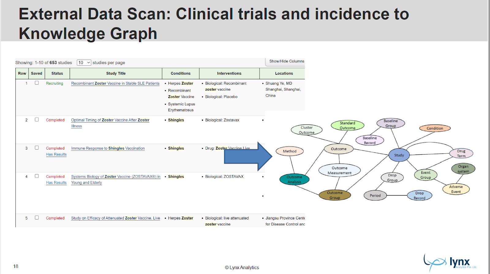
There is plentiful external data available to build such a knowledge graph which incorporates results from many (potentially thousands) clinical trials available online.
While individual records with side effects might be scarcely available, cohort data is plentiful, both from clinical trials as well as external databases such as VAERS.