


The Lynx Analytics logo is the instantly recognizable symbol and focal point of our brand. That's why it's so important to use the logo exactly as specified in these guidelines.


It is important that the appearance of the logo remains consistent. The logo should not be misinterpreted, modified, or added to. No attempt should be made to alter the logo in any way. Do not rotate, warp, or disproportionately scale the logo. Its orientation, color, and composition should remain as indicated in this document—there are no exceptions.


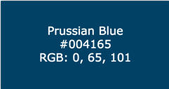
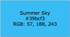
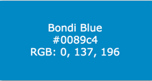
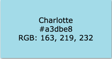
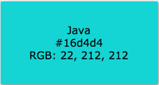
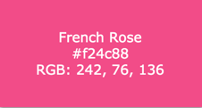
Our colors are bold, enthusiastic and full of energy. To ensure a unified brand, it is important to use these colors and these colors only.
View Full Color Palette/Shades
Primary Colors
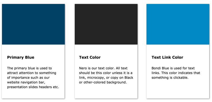
Primary colors, as you may have noticed, are used in the Lynx Analytics logo and should also be used to attract attention to something of importance.
Secondary Colors
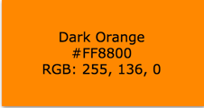
Secondary colors are used to provide vibrancy to a design. Use these energetic colors to complement primary colors and break up white space.
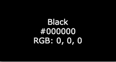
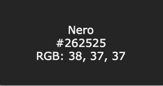
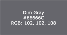
Dark Greys
Dark greys are primarily used for icons, copy and background colors.
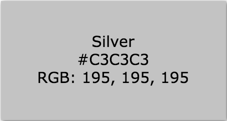
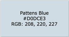
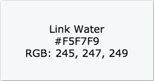
Light Greys
Light greys are primarily used as background colors and for icons.
Colors In Use
The color palette is used to add depth, boldness, and vibrancy to your pages and designs. Some colors, however, indicate specific uses or actions (particularly for web & presentation slides).
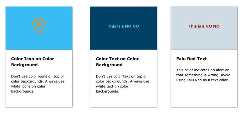
Things To Avoid
When it comes to color, there aren't many "dont's." The main call-out is don't use color on color. If you're using a color background, don't use color icons or text.
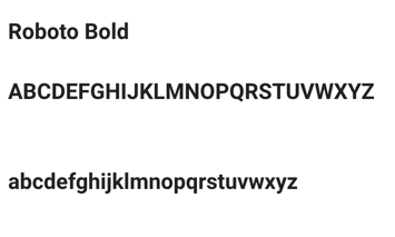
The type family for Lynx Analytics is Verdana and Roboto
Verdana Regular
ABCDEFGHIJKLMNOPQRSTWXYZ
abcdefghijklmnopqrstwxyz
Verdana Bold
ABCDEFGHIJKLMNOPQRSTWXYZ
abcdefghijklmnopqrstwxyz

Download Google Slide Templates
Download Microsoft Word Templates