Omnichannel Optimization Blog Turning Employee Feedback into Actionable Insight at Scale June 5, 2026
Life Sciences Analytics Blog Transforming Knowledge into Intelligent Conversation with Generative AI March 18, 2026
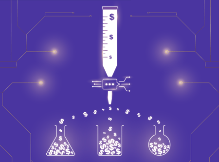
Omnichannel Optimization Blog $60M Reallocated. $100M Revenue Uplift. The AI that’s Changing Pharma Marketing June 5, 2026
Omnichannel Optimization Blog CRM x Generative AI The next level of customer engagement for pharma June 5, 2026