Life Sciences Analytics Blog Transforming Knowledge into Intelligent Conversation with Generative AI Admin March 18, 2026
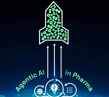
Launch Excellence Blog Agentic AI in Pharma - Rewriting the Rules for Drug Launches Admin June 5, 2026
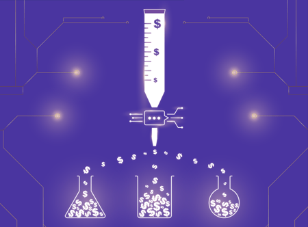
Omnichannel Optimization Blog $60M Reallocated. $100M Revenue Uplift. The AI that’s Changing Pharma Marketing Admin June 5, 2026